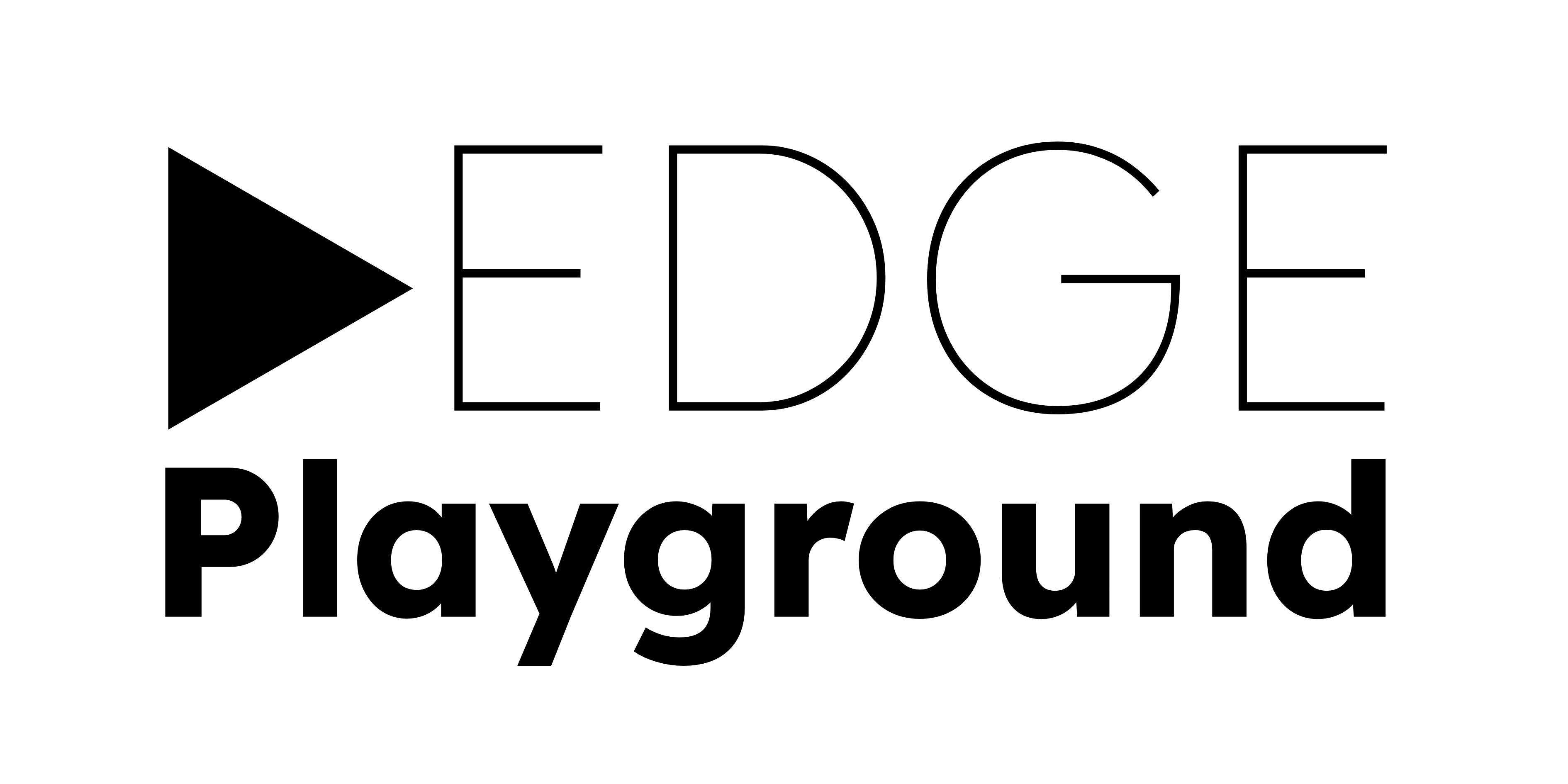
In the context of a;edge 2020 exhibition, the semicolon signifies giving equal importance to both traditional and contemporary art forms. Similarly, while designing our a;edge logo, we reexamine the basic elements of typography – where the arrangement of ‘type’ helps tomake written language readable and appealing.
During the process of designing the logo, we discovered the anatomy of types, such as the bowl, ear, ascender, serif and link; and at the same time learnt about its functions. In the past, typesetters at the printmaker shops would set the fonts and decide on the spaces in between in order for the type to ‘breathe’ and facilitate reading. The spacers they used were made of lead, hence, adding the space was known as leading. Both leading and fonts are measured in points such as 10, 12, 14 and fonts can have weight—bold, regular, or light—and the combination of the two is an art that when done well resulted in clear, even beautiful, communication. A subtle semicolon is also melded into the type, toying with the negative spaces of the letter ‘g’, to reflect this year’s theme.
Now that we’ve moved into the digital age and there’s easy access to lightning-fast computers, type creators have the freedom to create without the physical constraints of the earlier era. Nowadays, the fonts do not have to be represented by metal blocks and leading are not actual lead. As such, we have decided to highlight the different parts of the types in our a;edge 2020 logo to encourage viewers to consider why the specific parts of the type or letters were highlighted.
